Gelato Factory (not just another ice-cream brand) is a brand of artisanal gelato started by Silvia Latini and Francesco Carboni - an Italian couple with a passion for good food. Based in Pondicherry, Gelato Factory has a growing presence in south India. They have been able to achieve a product of high standards as their recipes, machinery and production methods adhere to the authentic Italian way of preparing gelato.
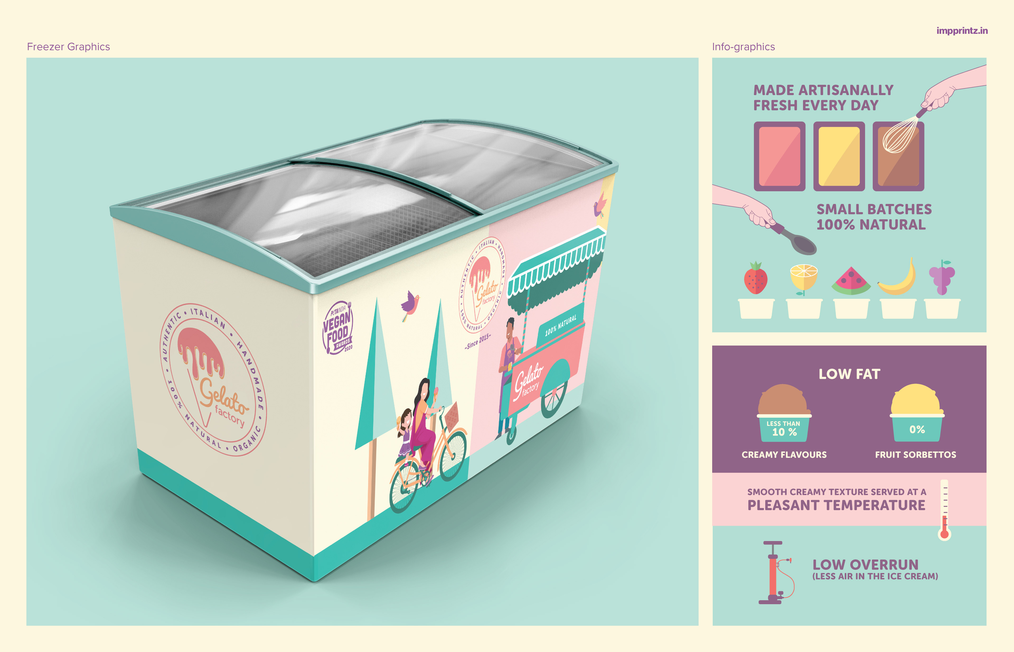
Their gelato is preservative-free, 100% natural and extremely low-fat, and uses only natural and fresh ingredients. They have vegan options, diabetic-friendly flavours and use organic ingredients as far as possible. The recipes and the expertise that go into making Gelato Factory flavours come from Frascati, a small village near Rome. They have also received training from a gelato master with thirty five years of experience in making artisanal gelato.
Their aim is to satisfy the customer who appreciates good taste and value for money - an affordable luxury. They are also an attractive option for the health conscious individual as their gelato is what some would call a “healthy dessert".
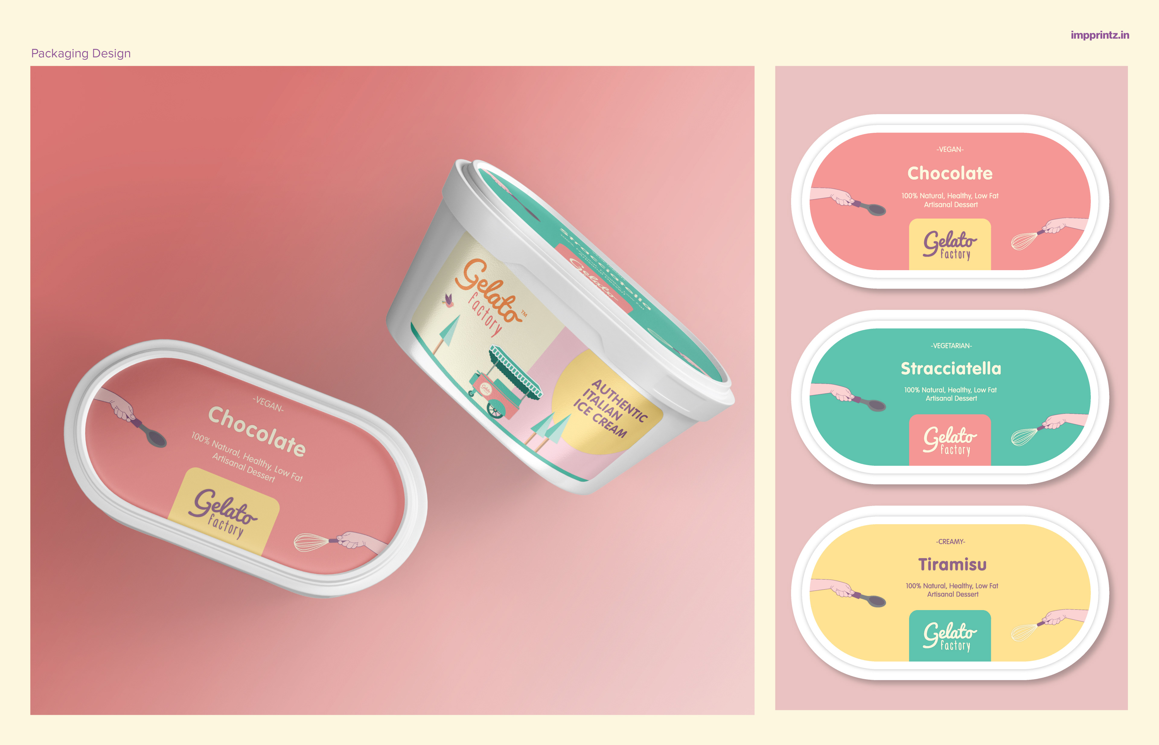
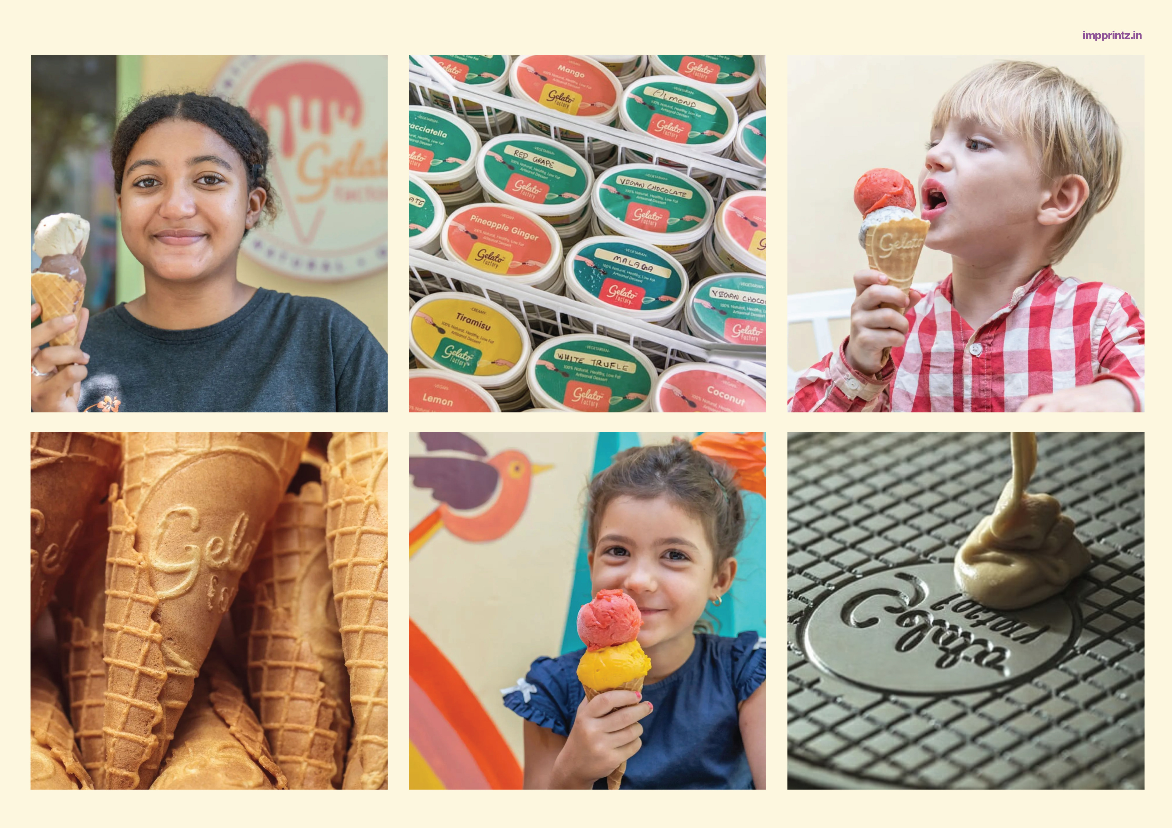
Gelato Factory was in need of a packaging design system that could work with their small-batch scale. A clear distinction was required between the 3 categories of gelato that they offer - vegan, vegetarian and creamy. The appeal needed to be artisanal, simple and fresh. A label system was devised for the same.
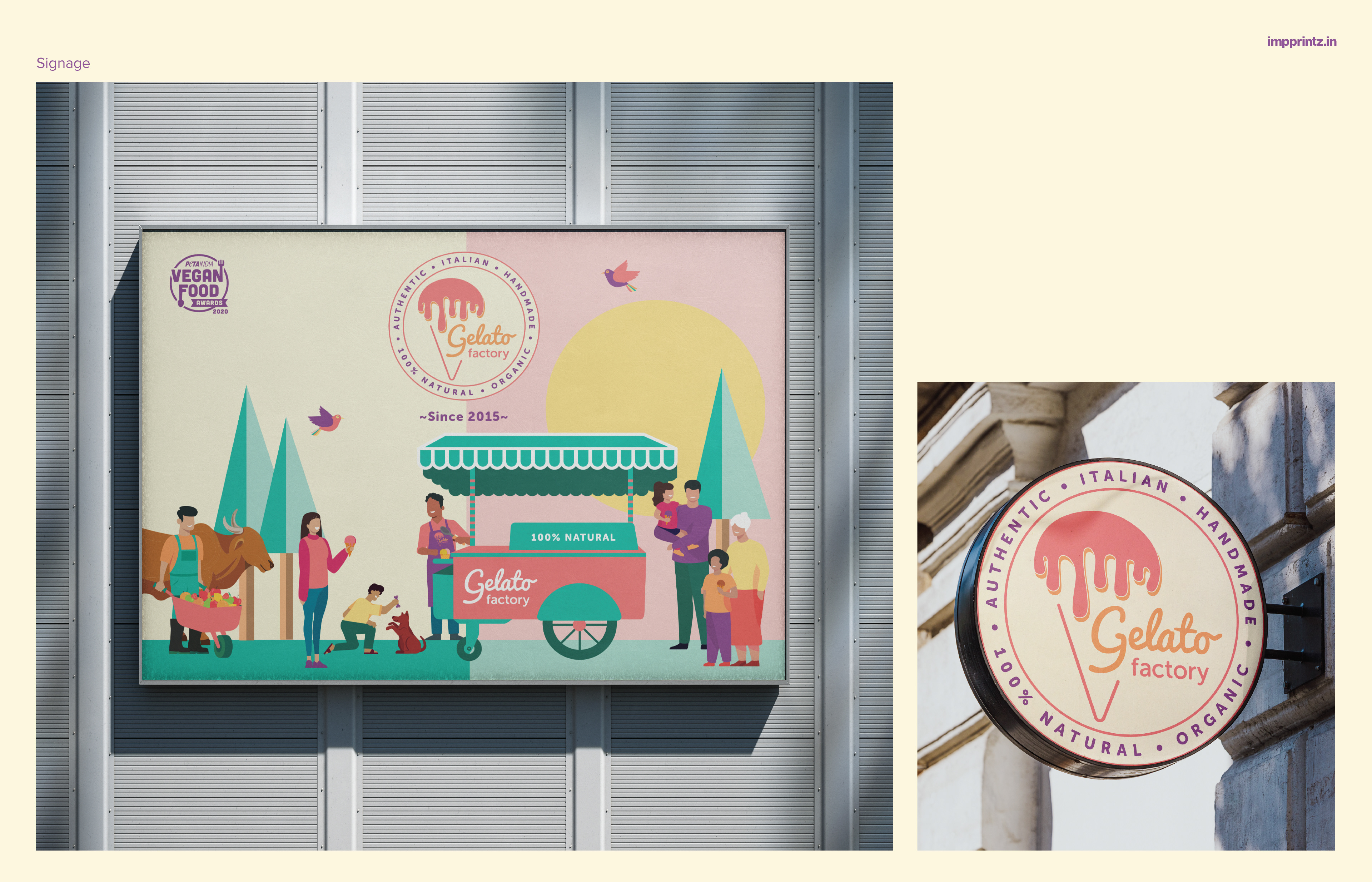
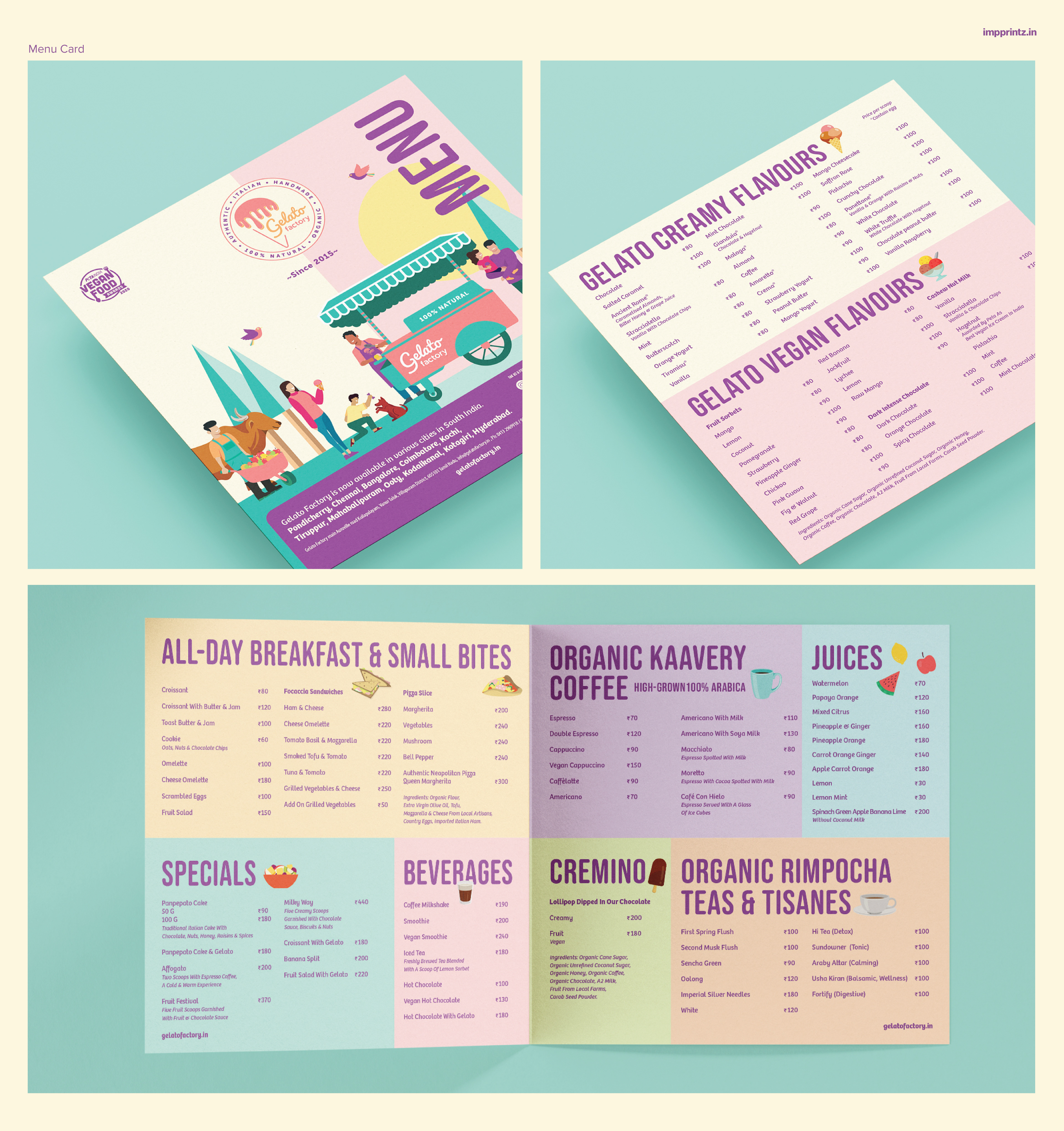
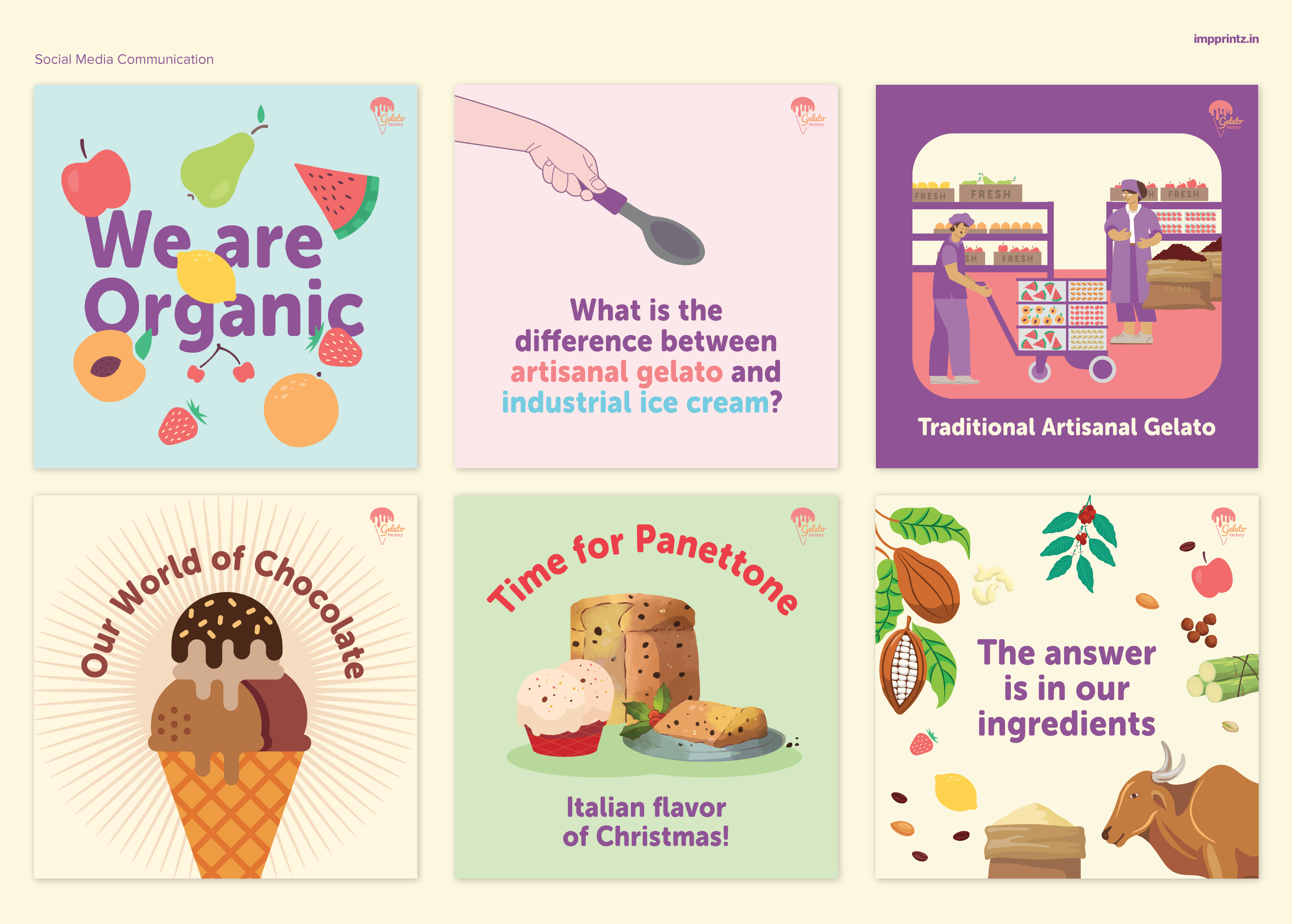
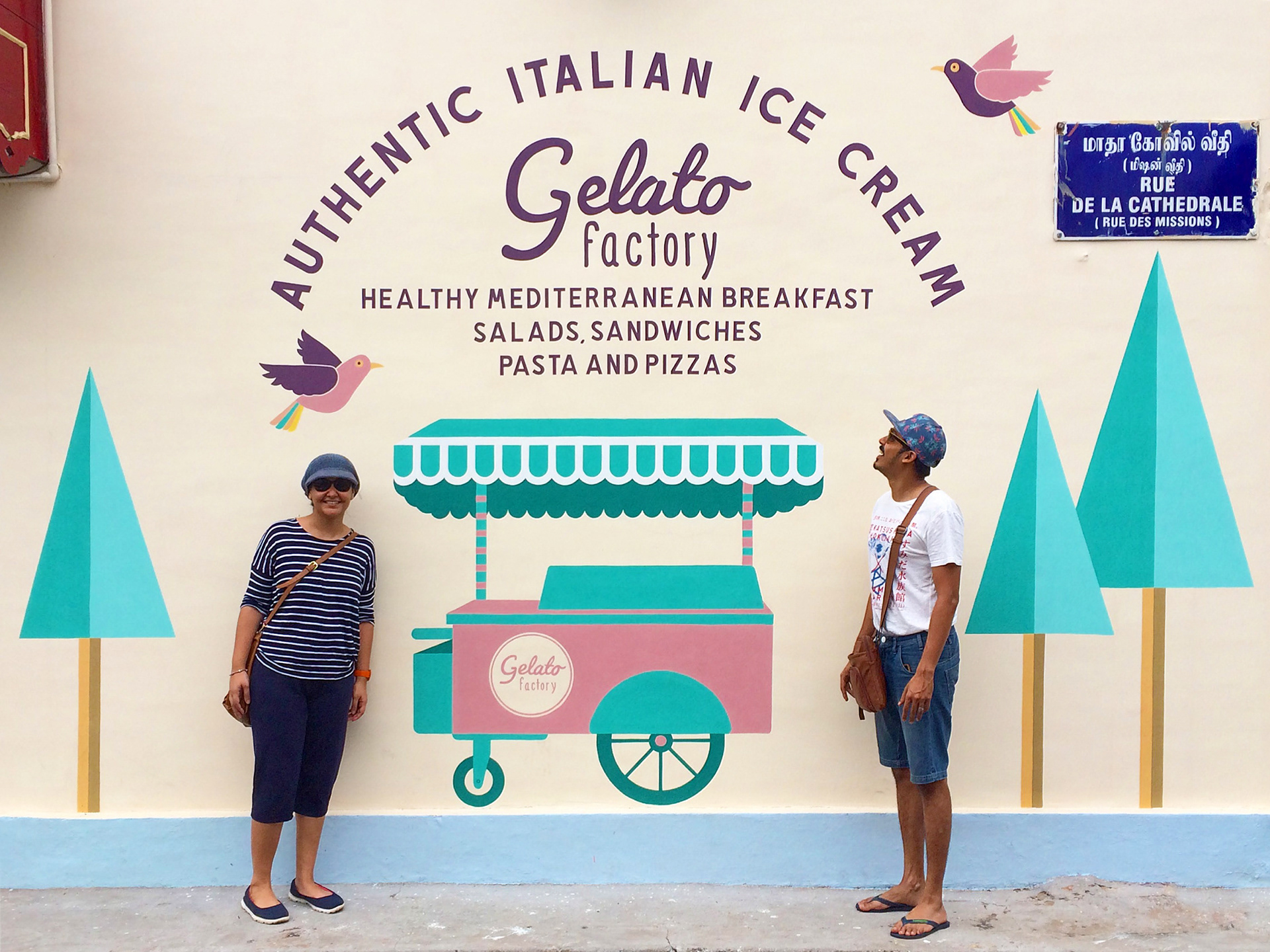
They further needed a design language which could be applied across various applications such as - a menu card, sign boards for the parlour, stickers to dress up the freezers, in-store communication, murals, social media posts and more. The design while being positive, simple, fresh and light, it also needed to be inviting to all people and groups.
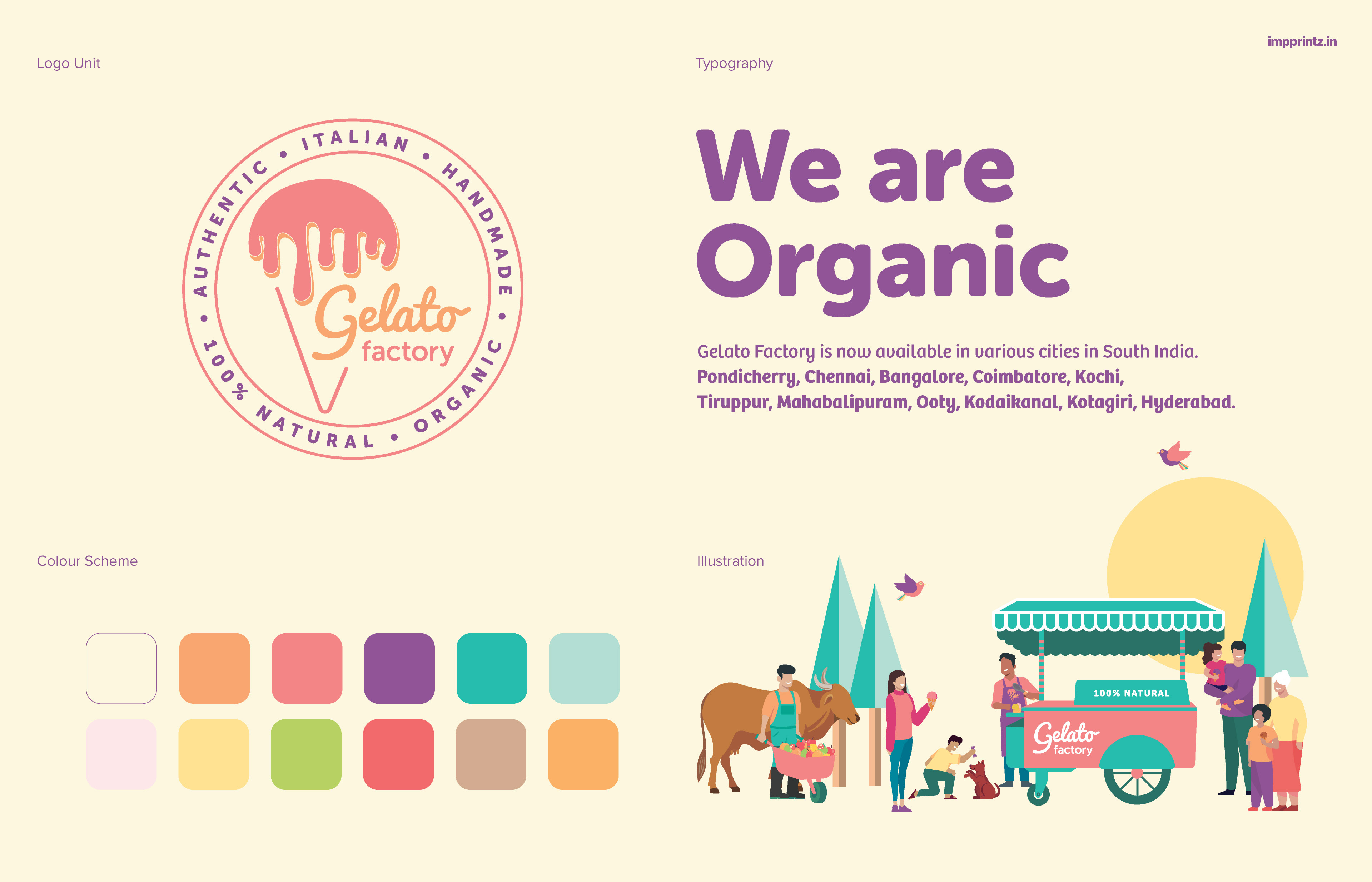
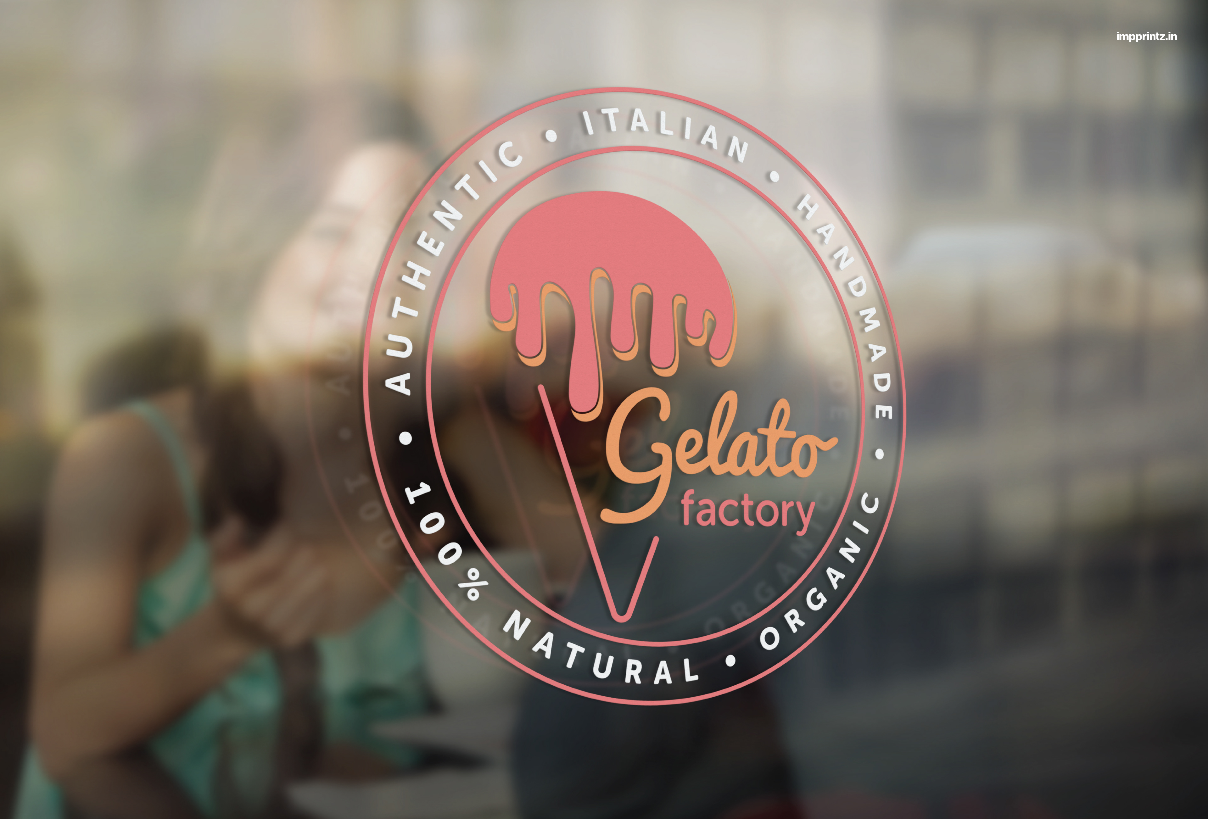
The brand and design has been slowly evolving over the years, as and when the requirement arises. The existing logo was given a refresh with enhanced colours and made into a unit with callouts that are true to the brand - placed in a circle around. A pastel colour palette has been worked out - some colours were inspired from fruits and ingredients along with some complementary colours. The typography uses clean and friendly fonts, extending the feeling of warmth. Illustrations of various people have been incorporated - children, families, elderly people, an ice-cream vendor, fresh fruits vendor, a dog (being a pet-friendly space), lending a sense of inclusivity to the target audience. Elements of nature also feature in the designs - the sun, birds and trees, to emphasise on the positive and natural aspects of the brand’s ethos; a healthy cow is included too, to focus on the quality and traceability of the milk used.