In 2022, Cosmic Cones emerged with a vision – to be the trusted supplier in pre-rolled cone manufacturing in the European and American markets. Born from a union of tobacco manufacturing and cannabis industry veterans, their mission was clear – to solve the challenge of a reliable and consistent quality supply of pre-rolled cones. Cosmic Cones is where expertise meets vision, creating an unbreakable bond of excellence and business associations.
They approached Impprintz for designing their brand identity and communication. The appeal needed to be new-age, progressive, credible and global.
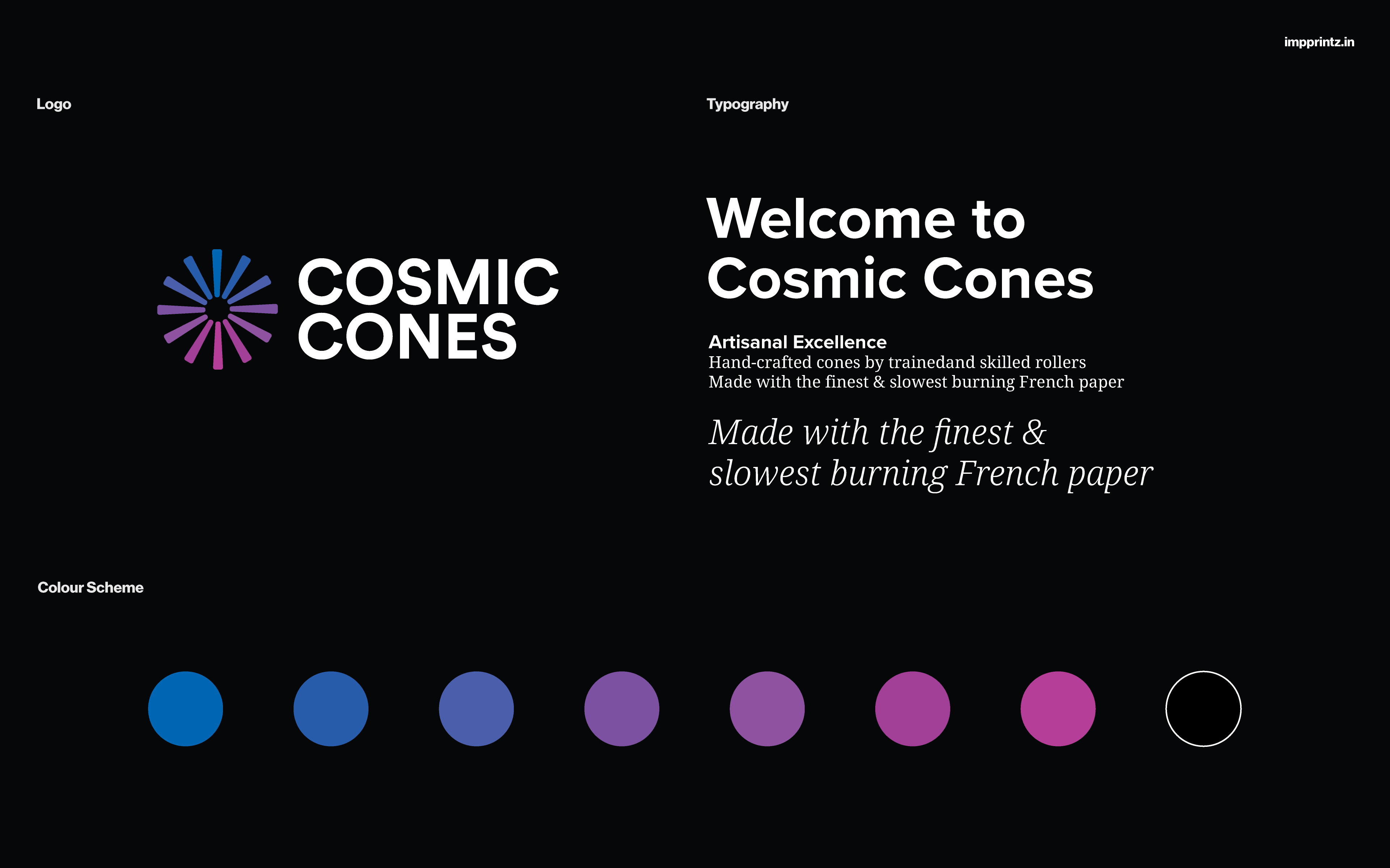
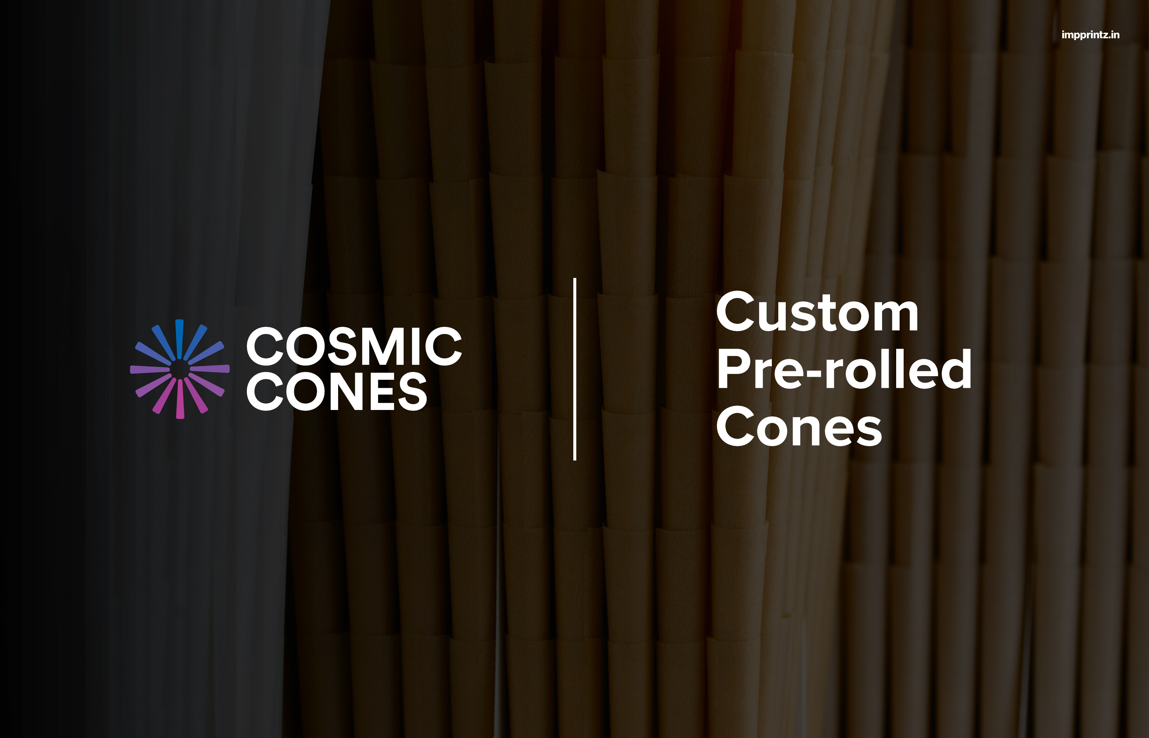
A symbol and word-mark was required for the identity. The devised symbol resembles a spark made of 12 cone shapes. The colour palette for the symbol is a transition of colours - blue to purple to pink, capturing a fascinating gradient found in the cosmos. The varied colours here are also representative of diversity and customisation, an important part of the brand's distinctive product offerings.
The word-mark is set in font that is modern, geometric and clean, inspired by the company's technical expertise and promised professionalism. Set in black or white, the word-mark maintains a neutral and corporate appeal.
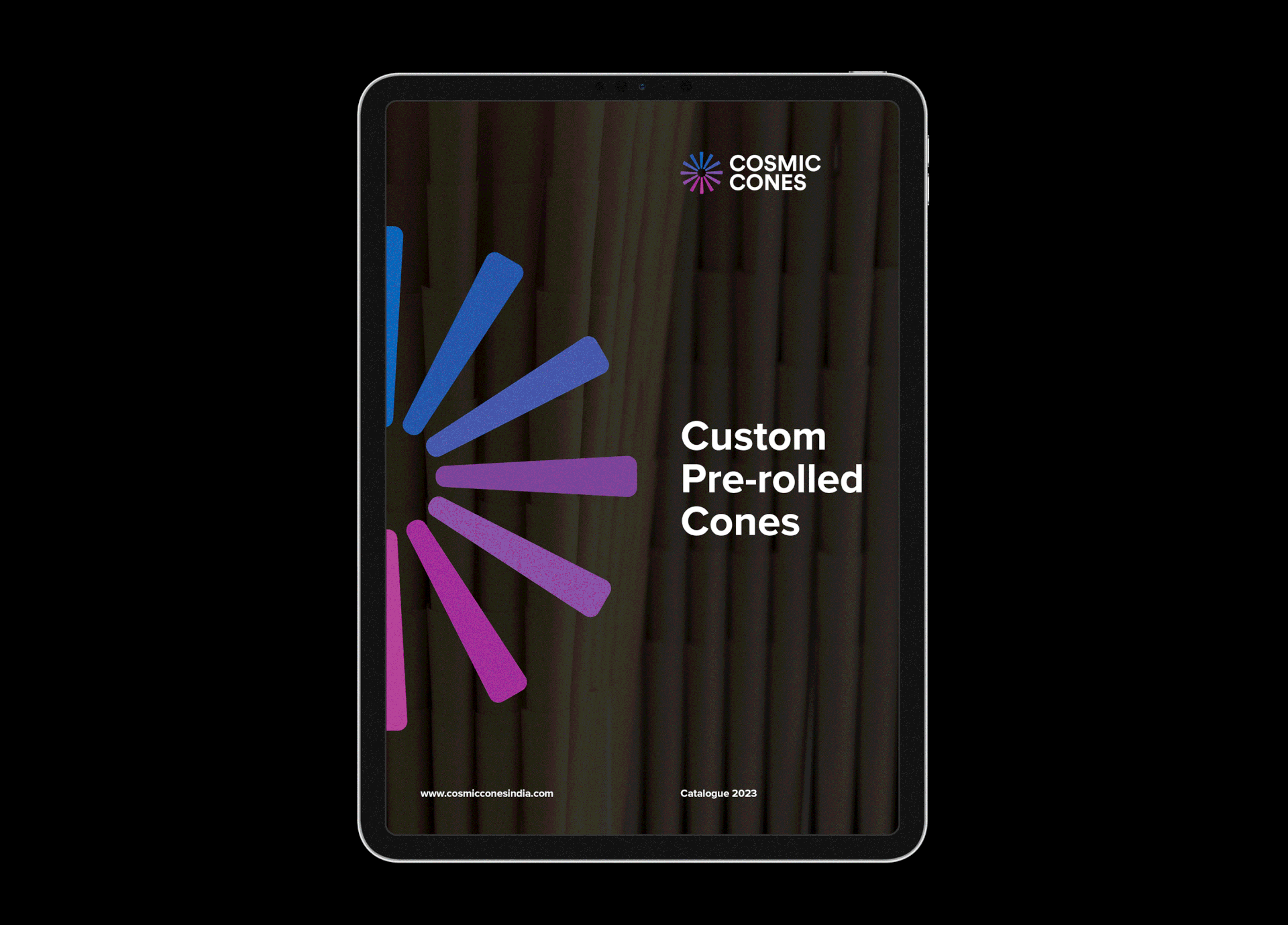
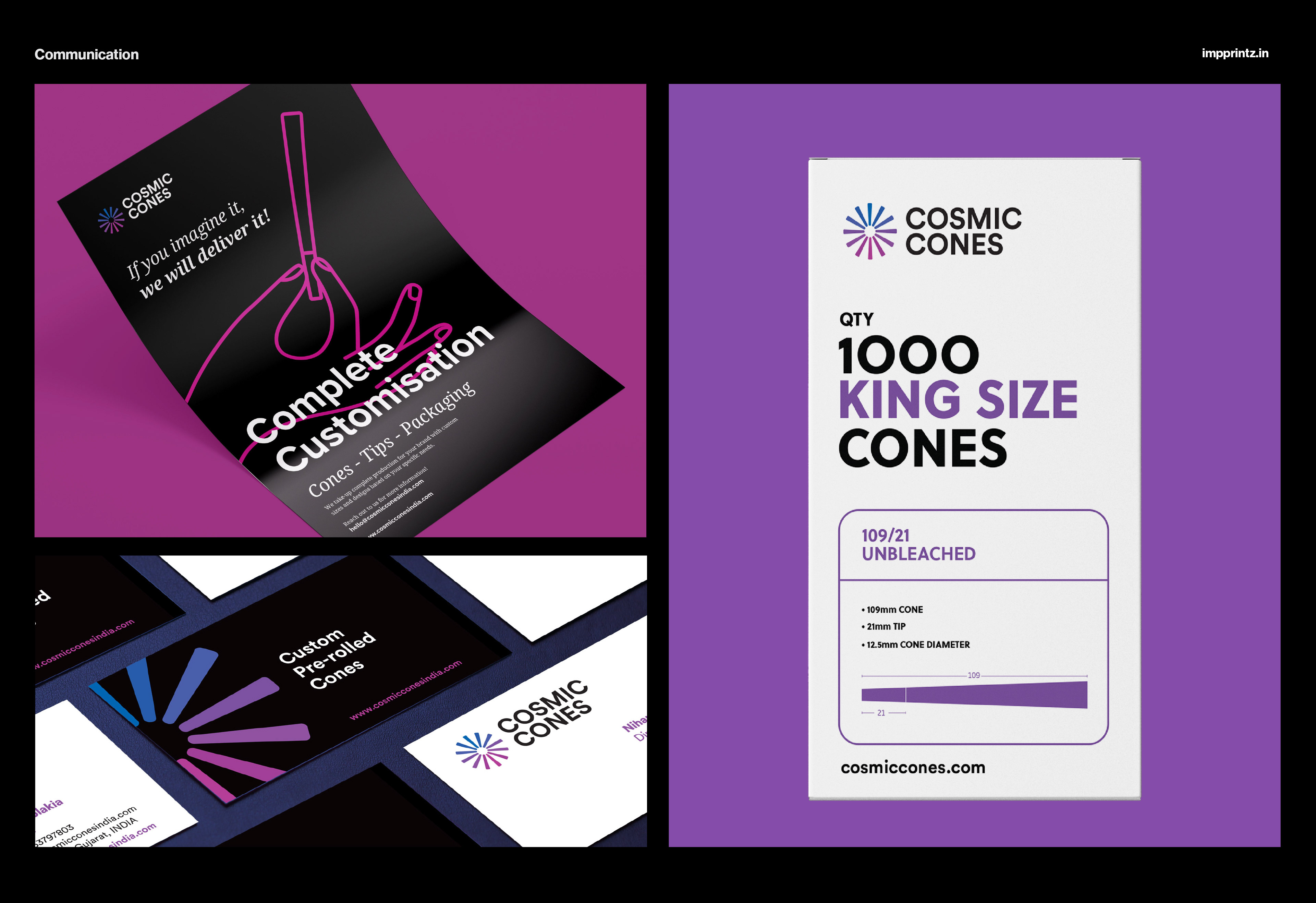
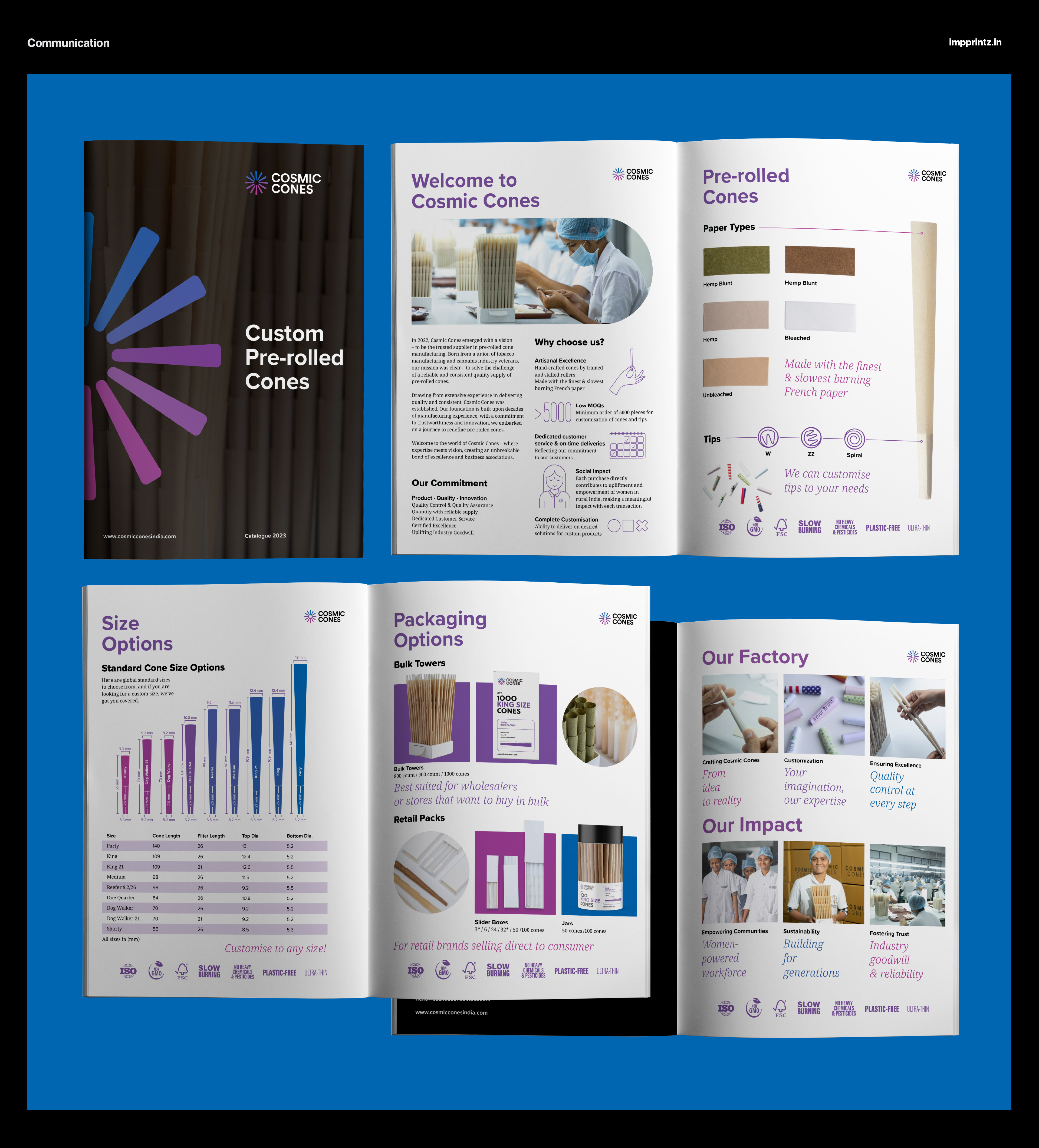
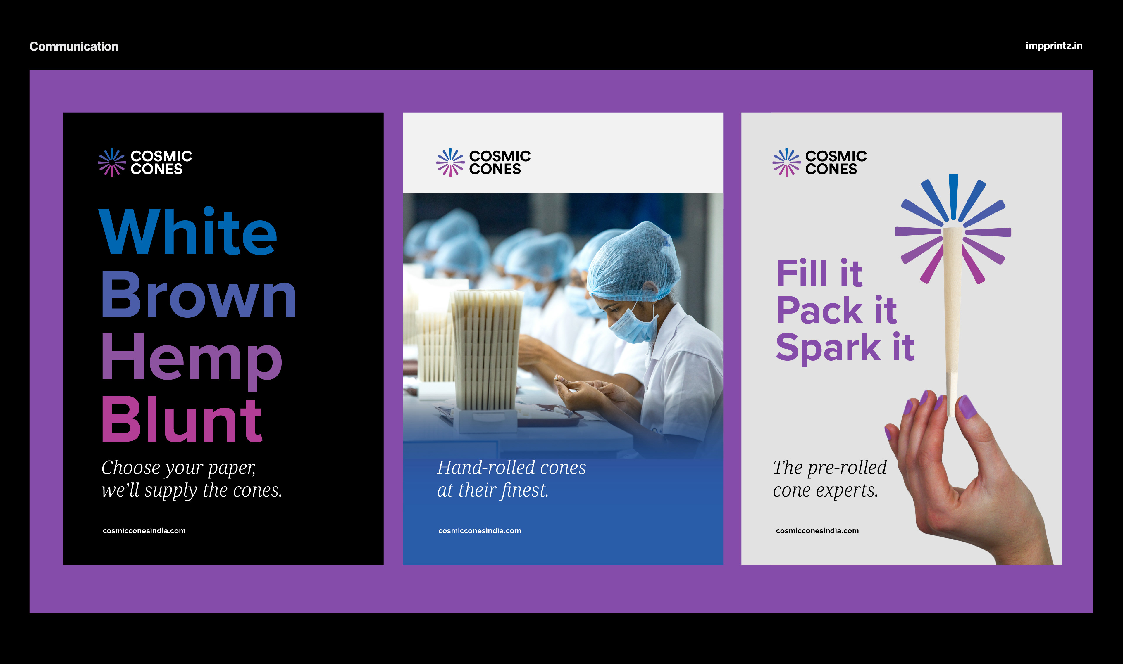
Pieces of brand communication further extend the brand identity. The brochure has been developed and designed to articulate the brand and it's offerings, keeping the appeal light, ownable and modern. The visiting card and flyer design follow the visual style of the brand, the proposed packaging has been created keeping in mind its B2B functionality.